


Meghan Carey has a designer’s dream job. She puts pen (or pencil) to paper to create stationery for one of the fashion world’s most notable names: Vera Wang.
Though wedding
dresses are perhaps the first thing that comes to mind when one hears that name,
they’re just a part of a more robust collection that includes Ready to Wear
pieces to fill the most coveted of closets. Her stationery is no different.
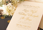
While wedding invitations are certainly a staple, boxed notes and cards for
everyday use round out Vera Wang’s paper portfolio.
Here, Carey talks about her
latest Vera Wang Boxed Stationery collection: its inspiration, her design
process and the favorites she begrudgingly shared. (It’s hard to choose just
one. Or four or five.)
You've been designing Vera Wang's stationery
collections for quite some time now — what's the one thing that has always
remained a constant thread throughout them all?
I always derive
inspiration directly from her Ready to Wear and Bridal collections. Sometimes
this is reflected in an obvious way — like the Black Invitation or the Radiant
Embossing — and sometimes the derivation is more subtle or conceptual.


Where did you draw inspiration for this collection?
With boxed stationery, we
have the opportunity to really showcase the whimsical side of Vera Wang and
take greater liberties in our interpretation of her textiles, trims and
palettes.

Tell me about your design process.
One of my favorite parts
of the job is attending the runway shows. I really start there. Then, I work
with the Vera Wang Licensing Team to obtain swatches and samples of everything.
Sometimes it's helpful to trace back to the designer's inspiration — even if a
certain sketch, poem or snapshot doesn't reveal itself in the final collection,
it is helpful to know where the idea came from.
Often, the impact of a
gorgeous garment will be more about the drape and cut than a textile or weave.
If I determine that Vera Wang is making a statement about unexpected layering
or surprising scale — and when I learn that she's looking at Rothko or 20th
century Russian dress — I'm better prepared to design something that aligns
with her current aesthetic.
Who do you see using the pieces of this collection and
for what occasion?
I am confident that there
is something for everyone in this collection. There are classic Engraved
Correspondence Cards and Informal Notes for the more traditional and
understated consumer, while I see the punchy Distressed Foil collection
appealing to a more confident and modern aesthetic. Personally, I think the
Watercolor Thank You Notes are an adorable assortment, fitting for a range of
consumers, while the Embossed Notes (on colored paper) are more subtle and
offer an accessible level of sophistication.
I know they're all your children, but do you secretly
have a favorite?
Shoot. Really? I have to
choose? I have four favorites! The Blush Zinnia, The Gilded-Era Fill-In, The
Gold Bordered Thank You and the Distressed Paisley! Oh and the Amethyst ThankYou Assortment. I guess that's five.


No comments:
Post a Comment