

 From this brief Q&A with wedding designer Karen Herzig, we concluded
a few things: Williams have played a large role in her life, saltwater runs
through her veins and she is responsible for hundreds of weddings that never took
place.
From this brief Q&A with wedding designer Karen Herzig, we concluded
a few things: Williams have played a large role in her life, saltwater runs
through her veins and she is responsible for hundreds of weddings that never took
place. To celebrate the upcoming debut of the new William Arthur Weddings Volume One album, we talked to Karen, its designer, about her journey from newspaper to the finest of papers, invitation trends and the one design that never goes out of style.
How many years have you been working for William Arthur?
I started working for William Arthur in 1992, which makes that a very long time!
I actually was planning to go to law school upon graduation from
Williams College in 1981, but after working for a firm prior to my first year
in law school, I decided it wasn't for me. Having always had a love of art
and writing, I applied for a graphic design position at a local newspaper and
ended up directing their graphic design department. From there I moved to Cape
Cod (I always want to be near the ocean!) where I lived for over ten years
working for an advertising agency as their art director, and then having my own
design firm. I started a family there and now have two grown sons—a chemistry college
professor and a game designer. As different as they could be, and as wonderful!
When I first moved to Maine, I couldn't believe my luck that there was
a company like William Arthur right in Kennebunk. I began working with the
owner/creative director and the art director in a supportive design role. This
role was both art and type design driven. I learned a lot about the
important part stationery can play in peoples’ lives. Along with the growing
company, I grew professionally moving into the role of Product Line
manager, and ultimately Art Director for Wedding, Invitations and Social
Stationery. I love working with the subtleties of fine stationery design.
Having a strong affinity with type design and love of letter-forms, I enjoy
creating exciting new type combinations and monograms. It’s amazing how the
industry has changed over the years, but good design always stays the
same.
What are some of the trends you're seeing in wedding invitations today, and how did you apply them to the new William Arthur album?
Today's bride and groom carry the same desires as any throughout history: wanting their wedding reflect who they are as a couple and their invitation to set that tone. There is a confidence in who they are together that is reflected in their stationery choices. From classical and romantic to rustic, whimsical or vintage, each trend mirrors the bride and groom's aesthetic.

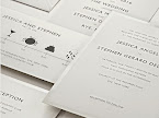
The new William Arthur wedding album offers a variety of styles in each trend so that any couple can open the book and find something that speaks to them. Numerous options include modern to classic typestyles, motifs and lining and ink colors. These options allow customization enabling them to create their perfect invitation. Color trends include pale blush, soft grey, taupes and metallics, and are reflected in new linings and ink colors. The vintage trend is captured in both type design and an embossed scalloped design that harkens to the 1920's. A pale gold paper that creates a laser-cut lace pocket picks up on the metallic and lace trends.
How do you come up with
the names and info that go onto each invitation?
Copywriting is always an enjoyable challenge when designing a new wedding album. We want to show a variety of locations, demographics and religious affinities.
Copywriting is always an enjoyable challenge when designing a new wedding album. We want to show a variety of locations, demographics and religious affinities.

I will look at the popular names from a certain time period to get inspiration. Often the letterform of a particular first letter of a name will influence which name I might use. It is fun to imagine what a certain couple would be like choosing that particular design—where they might be from and what their style would be—almost like creating characters in a book.
What is your favorite
part of designing a wedding album?
The very beginning, when I choose the palette, start to plan my designs and try to execute them in a way that works as a whole. It’s exciting to create motifs and monograms that pick up on elements of the border or lining design.
The very beginning, when I choose the palette, start to plan my designs and try to execute them in a way that works as a whole. It’s exciting to create motifs and monograms that pick up on elements of the border or lining design.
I know they are all your
children, but can you pick a favorite from the new album?

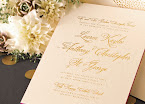
Over the years, the classic beaded border has been perfect for so many brides. Like a string of pearls, it never goes out of style. I've created an updated version (pictured above) with an embossed design that has beading in a scalloped form that is both vintage and classic. An embossed floral scroll design on a large ecru card with a matching pearl foil lining is one of my absolute favorites. I love it when the lining and the embossing work together to create the perfect duo.
Sign up for our monthly newsletter. It's oh so lovely.


No comments:
Post a Comment